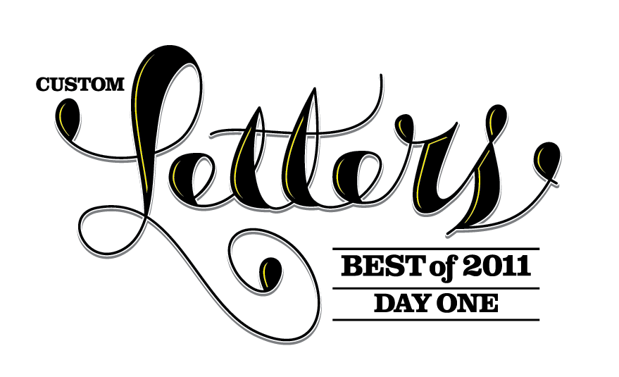
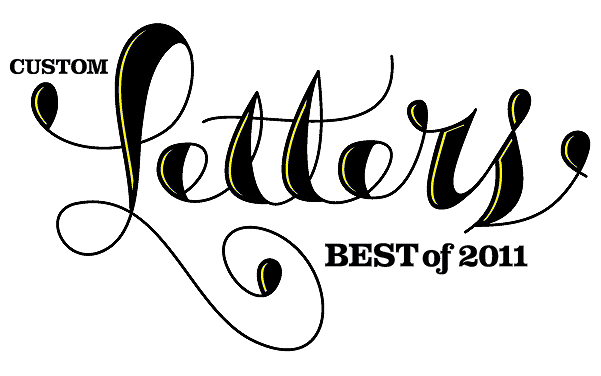
Submissions were fantastic, and some stragglers will be coming in tomorrow and after. Information on B on the next page. Thanks everyone and great job!
ALPHABATTLE IS A BIT OF a misnomer.
There are no actual battles, no talkin’ trash, no smokin’ fools, no winners, no losers—just an opportunity to express yourself with Custom Letters among some like-minded peers.
Make letters. Have fun.
Drout 750, aka Paul O’Sullivan, started AlphaBattle last year as a Flickr group, based on a concept that goes back nearly 10 years to various grafitti forums. This is the reboot, version 2.0.
We’ll start with A, do a new letter every two weeks, and finish with Z, about this time in 2011. Fifty-two weeks, twenty-six letters.
{ 2 comments }
“The work you do while you procrastinate is probably the work you should be doing for the rest of your life.” — Jessica Hische
RIGHT NOW, FOR JESSICA Hische, that work—the work she should be doing for the rest of her life—is making letters.
Right now, she sits at a computer in her Brooklyn apartment, hanging out with her two cats as she chats on the internet.
The cats try their best to stop her from working—blocking access to her mouse, and laying down on her keyboard. But Olive (fat and loud) and Billy (a space cadet who sings in the shower) are prone to constant naps and have not been very successful stopping her.
Indeed, in 2009, Jessica Hische was unstoppable.
PICKING A TOP 10 WAS PURE AGONY!
That was the consensus from our panel of type and lettering aficionados, who picked their ten favorite pieces from our Best of 2009.
We used their input to help pick the LetterCult Top 10—after the jump, along with the Top 10s from our contributors. (The Top 10s are not ranked 1-10.)
It was a fun exercise with subjective results. Thanks for taking a look.
Thursday night: an interview with the Custom Letters Person of the Year. Edit: Friday afternoon. [click to continue...]
THE YEAR IN CUSTOM LETTERS, 2009.
Appreciation for the people making Custom Letters. Inspiration for everyone else. A whole lot of great work.
Wednesday, we’ll pick a Top 10.
Thursday, we’ll have a feature/interview with the Person of the Year.
Enjoy! nom nom nom.
Now that the year is over, the fun begins as we sort through the best and the brightest in Custom Letters for 2009!
We will release our Best of 2009 on Monday, Feb. 1, and we’ll also have a list of our Top 10 favorites, a Custom Letters Person of the Year, and a few other things.
Here was our Best Of at the halfway point of 2009.
The Custom Letters category includes calligraphy, sign painting, graffiti, stone carving, digital lettering, hand lettering, paper sculpture, and original type design. It could also involve making letters with sticks and berries, or carving letters into a tree. It’s an elastic category.
The Custom, in this instance, means built from scratch; we aren’t looking for customization—a type treatment or 3d treatment—of an existing typeface. It can be 3D if it’s built from scratch, and not simply an extrusion of an existing typeface.
A few other things:
• The deadline to submit is Sunday, Jan. 24, midnight Pacific time.
• We’ve set up a dedicated Gmail account for submissions: lettercult [AT] gmail.com. You can submit for yourself or others. Make sure your submission, or the linked image, is at least 800 pixels wide. We’ll confirm receipt of your submissions, but we won’t contact you after that. There is no limit to the number of submissions you can make, but please edit yourself, and pick your best work. Please include a link to your site. And please do not send work completed before 2009.
• Through Jan. 24, you can also add your piece to the Custom Letters Flickr group. If you already have something there, you don’t need to resend.
• If you don’t submit, there’s still a good chance we’ll find your piece if you’ve uploaded it somewhere. However, if it’s on your site, and it’s unclear what year you created it, we won’t include it.
• We are aware of certain styles that get copied. If you’re aping the current Designer of the Moment, we’d ask you to please, find something original to submit.
• Everyone included in our Best of 2009 First Half is now part of the Best of 2009 for the Year. If you’re on that first list, email us and we’ll include a link to your site.
• If you or someone you know are not on our list of LetterMakers, email us.
• Once the list comes out, we cannot add any more pieces, so please, pass this on and send us links so we don’t miss anything.
Thanks!
{ 0 comments }
EVERY SO OFTEN, THE mail carrier arrives with another bottle of wine, another gift from a client for a job well done.
Jordan Jelev opens the box, unwraps the wine, and studies the label.
The wine label is his canvas, a place where he transforms his design and lettering into hand-crafted works of art.
Jelev, a designer from Bulgaria, has earned a reputation for his excellent wine labels—his nickname is The Labelmaker—but his work goes beyond labels. Lately, he has been experimenting with different approaches, different tools, and different styles. Making letters has become his work, his play, his obsession, his passion.
The free bottles of wine aren’t bad, either.
“Yes, I am a dedicated wine drinker, though I consider myself a total amateur in this field,” Jelev says in an email, adding his usual
at the end.
{ 13 comments }
THE COMIC BOOK VENDOR with the moustache sneered at me.
I’d asked him a simple question. Now, he seemed offended.
“You wanna take a picture of what?” he asked.
“The letters.”
“The letters?”
“Yes. Some of the lettering.”
“And why is that?”
“Because…I like letters.”
He went silent. He was studying me.
{ 13 comments }
As we approach the halfway point of 2009, we’ve begun seeking out the best and brightest in the ol’ Custom Letters Dept. And we are asking for submissions—if you see something we’ve missed, please send us a link.
Custom Letters is an evolving category that includes calligraphy, sign painting, graffiti, stone carving, digital lettering, hand lettering, paper sculpture, and type design (we’d prefer to feature new/original type over, say, revivals).
Custom, in this instance, means built from scratch; we aren’t looking for customization—a type treatment or 3d treatment—of an existing typeface.
We’ll be adding more pieces as the year progresses, culminating with a Best of 2009 at the end of the year.
Now to the good, the great, and the notable stuff we’ve seen so far in 2009.
{ 69 comments }
PENCIL. RULER. FRENCH CURVE. RAPIDOGRAPH. VELLUM. X-ACTO KNIFE.
If you were an independent type designer, circa 1977, these are the tools you might use to create a typeface.
These were the tools that Mark Simonson used to create Kandal, a wedge serif typeface with an intriguing backstory. 
The Making of Kandal spanned three decades, four Presidents, and a move from ink to digital.
Simonson began the typeface in the 70s, and called it Excalibur; it was tweaked in the 80s; and it was finally released in the 90s as Kandal.
Simonson, whom we interviewed last fall, agreed to an in-depth discussion of the typeface.
In an age of digital creation and instant gratification, it’s instructive to look at how things used to be done, sans computer. And Kandal is also a story of persistence in pursuit of a dream.
{ 13 comments }


