CUSTOM LETTERS 2009

by Beejay on February 1, 2010


THE YEAR IN CUSTOM LETTERS, 2009.

Appreciation for the people making Custom Letters. Inspiration for everyone else. A whole lot of great work.

Wednesday, we’ll pick a Top 10.

Thursday, we’ll have a feature/interview with the Person of the Year.

Enjoy! nom nom nom.

[click to continue…]

BEST OF 2009 – CALL FOR SUBMISSIONS

by Beejay on January 2, 2010


HAPPY NEW YEAR EVERYONE!

Now that the year is over, the fun begins as we sort through the best and the brightest in Custom Letters for 2009!

We will release our Best of 2009 on Monday, Feb. 1, and we’ll also have a list of our Top 10 favorites, a Custom Letters Person of the Year, and a few other things.

Here was our Best Of at the halfway point of 2009.

The Custom Letters category includes calligraphy, sign painting, graffiti, stone carving, digital lettering, hand lettering, paper sculpture, and original type design. It could also involve making letters with sticks and berries, or carving letters into a tree. It’s an elastic category.

The Custom, in this instance, means built from scratch; we aren’t looking for customization—a type treatment or 3d treatment—of an existing typeface. It can be 3D if it’s built from scratch, and not simply an extrusion of an existing typeface.

A few other things:

• The deadline to submit is Sunday, Jan. 24, midnight Pacific time.

• We’ve set up a dedicated Gmail account for submissions: lettercult [AT] gmail.com. You can submit for yourself or others. Make sure your submission, or the linked image, is at least 800 pixels wide. We’ll confirm receipt of your submissions, but we won’t contact you after that. There is no limit to the number of submissions you can make, but please edit yourself, and pick your best work. Please include a link to your site. And please do not send work completed before 2009.

• Through Jan. 24, you can also add your piece to the Custom Letters Flickr group. If you already have something there, you don’t need to resend.

• If you don’t submit, there’s still a good chance we’ll find your piece if you’ve uploaded it somewhere. However, if it’s on your site, and it’s unclear what year you created it, we won’t include it.

• We are aware of certain styles that get copied. If you’re aping the current Designer of the Moment, we’d ask you to please, find something original to submit.

• Everyone included in our Best of 2009 First Half is now part of the Best of 2009 for the Year. If you’re on that first list, email us and we’ll include a link to your site.

• If you or someone you know are not on our list of LetterMakers, email us.

• Once the list comes out, we cannot add any more pieces, so please, pass this on and send us links so we don’t miss anything.

Thanks!

{ 0 comments }

JORDAN JELEV

by Beejay on August 10, 2009


EVERY SO OFTEN, THE mail carrier arrives with another bottle of wine, another gift from a client for a job well done.

Jordan Jelev opens the box, unwraps the wine, and studies the label.

The wine label is his canvas, a place where he transforms his design and lettering into hand-crafted works of art.

Jelev, a designer from Bulgaria, has earned a reputation for his excellent wine labels—his nickname is The Labelmaker—but his work goes beyond labels. Lately, he has been experimenting with different approaches, different tools, and different styles. Making letters has become his work, his play, his obsession, his passion.

The free bottles of wine aren’t bad, either.

“Yes, I am a dedicated wine drinker, though I consider myself a total amateur in this field,” Jelev says in an email, adding his usual :) at the end.

[click to continue…]

{ 14 comments }

CUSTOM LETTERS at COMIC CON

by Beejay on July 27, 2009


THE COMIC BOOK VENDOR with the moustache sneered at me.

I’d asked him a simple question. Now, he seemed offended.

“You wanna take a picture of what?” he asked.

“The letters.”

“The letters?”

“Yes. Some of the lettering.”

“And why is that?”

“Because…I like letters.”

He went silent. He was studying me.

[click to continue…]

{ 13 comments }

CUSTOM LETTERS – FIRST HALF 2009

by Beejay on June 14, 2009


SO MUCH GOOD STUFF SO FAR.

As we approach the halfway point of 2009, we’ve begun seeking out the best and brightest in the ol’ Custom Letters Dept. And we are asking for submissions—if you see something we’ve missed, please send us a link.

Custom Letters is an evolving category that includes calligraphy, sign painting, graffiti, stone carving, digital lettering, hand lettering, paper sculpture, and type design (we’d prefer to feature new/original type over, say, revivals).

Custom, in this instance, means built from scratch; we aren’t looking for customization—a type treatment or 3d treatment—of an existing typeface.

We’ll be adding more pieces as the year progresses, culminating with a Best of 2009 at the end of the year.

Now to the good, the great, and the notable stuff we’ve seen so far in 2009.

[click to continue…]

{ 82 comments }

THE MAKING OF KANDAL

by Beejay on June 7, 2009


PENCIL. RULER. FRENCH CURVE. RAPIDOGRAPH. VELLUM. X-ACTO KNIFE.

If you were an independent type designer, circa 1977, these are the tools you might use to create a typeface.

These were the tools that Mark Simonson used to create Kandal, a wedge serif typeface with an intriguing backstory.

The Making of Kandal spanned three decades, four Presidents, and a move from ink to digital.

Simonson began the typeface in the 70s, and called it Excalibur; it was tweaked in the 80s; and it was finally released in the 90s as Kandal.

Simonson, whom we interviewed last fall, agreed to an in-depth discussion of the typeface.

In an age of digital creation and instant gratification, it’s instructive to look at how things used to be done, sans computer. And Kandal is also a story of persistence in pursuit of a dream.

[click to continue…]

{ 14 comments }

MICHAEL DORET

by Alex Savakis on May 31, 2009


MICHAEL DORET’S WORK SEEMS familiar. Bold and colorful lettering with complementary graphics evoke memories of roadhouse signs on Route 66 or the bright marquees of the Great White Way.

Growing up in New York City, Doret was surrounded by classic mid-century American icons. He lived in Brooklyn, near Coney Island, where he came face-to-face with bold and freaky graphics and signs. Those influences shaped him and his work, as Doret reveals in this interview, conducted at his Los Angeles studio.

[click to continue…]

{ 15 comments }

COREY HOLMS

by Beejay on March 4, 2009


COREY HOLMS IS THAT GUY WHOSE work you might have seen, but maybe you never put a name to the work, or a face to the name.

We correct that today.

If you follow pop culture, you’ve probably seen his Sopranos logo, some of his fonts, or his movie posters, most recently, his work on Watchmen, which opens everywhere at midnight on Thursday.

Indeed, Watchmen, based on the celebrated graphic novel, gave Holms an opportunity to do a lot of highly visible poster work. But it’s the relatively invisible details that we’ll talk about here.

[click to continue…]

{ 26 comments }

JOHN SOLIMINE

by Beejay on February 22, 2009


MISS GARVEY, THIRD GRADE TEACHER, was the first to notice his gifts. John Solimine would shift uncomfortably in math or science, but when it came to art or penmanship, he was Miss Garvey’s prize pupil.

He could draw better than most kids, but he also really cared about his penmanship. He was a cursive freak. Every curve had to be perfect.

“I wanted my handwriting to look exactly like the letters in the book,” Solimine says.

Fast forward 20 years. Solimine now sits uncomfortably in his cubicle at a large Chicago agency. He’s doing mostly web work. Long hours in a stressful environment—kinda like third grade all over again. In the thought bubble over his head, he’s picturing a different life. One in which he could draw every day, work with his hands. He’d be happy with that.

So finally, one day in November of 2006, he quit his job at Leo Burnett.

“I found myself putting a lot of effort and hours into something that I didn’t like and wasn’t learning anything from,” Solimine explains. “Despite the healthy paycheck, I was fed up enough to throw all that effort into something that I actually enjoyed.”

[click to continue…]

{ 7 comments }

BUSK

by DAV on November 15, 2008


B.U.S.K. — You may have noticed the combination of letters before. The
name/alias of one of Austria’s most prolific alternative artists appears all over. Different cities, different mediums of choice, different approaches. From spray paint, to paste ups, to folded paper, to type design. His love for typography and lettering arose around 1995 and since then, he has continued to amaze with his (art)works and stunning output.

[click to continue…]

{ 15 comments }

MR. BEAUTIFOOL

by Beejay on October 21, 2008


HE LEFT JAPAN, LEFT HIS FAMILY, and found himself at a little-known art school in Maine, the coldest place he could ever imagine.

Satoru Nihei, aka Mr. Beautifool, has never followed a traditional path.

His parents are proud teachers—he’s a high-school dropout.

He landed a job with Gento Matsumoto, a legendary designer in Japan—he left the job and moved to the United States.

He went to art school—and found he had a passion for graphic design.

The zigs and zags finally formed a career path, and everything crystallized four years ago when Satoru met 3st’s Rick Valicenti, one of the industry’s most respected designers.

[click to continue…]

{ 9 comments }

13THFLOOR

by Beejay on October 2, 2008


CARS, SKULLS, FLAMES AND Kustom Letters.

For 15 years, Dave Parmley and Eric Ruffing have been holding things down in the Action Sports, Entertainment, and Gaming Industries, leading 13THFLOOR Design with a mix of youthful exuberance and a commitment to Keeping things Kustom—they spell it with a K.

“We don’t stress, it’s fun,” says Ruffing. “But we take what we do very seriously for ourselves and the client’s sake.”

Parmley was working as Design Director at surf giant O’Neill in the early ’90s when he hired Ruffing. The two bonded quickly.

“Eric and I have always worked really well together—no ego, best idea wins,” Parmley says. “We found this chemistry…and that’s a big reason we started 13THFLOOR together.”

13THFLOOR has emerged as a go-to resource among Action Sport companies, and both Ruffing and Parmley continue to mountain bike, bmx, and surf the breaks in Orange County, CA, staying in touch with their core audience.

Lately, they’ve been doing a lot of work for Mattel, Hot Wheels, Harley Davidson, X-Games, and Fox Sports. With each piece, they set out to create Kustom Letters.

“We must create our own type solutions,” Ruffing says. “No fonts.”

interview conducted via ICHAT
q and a

So you guys left O’Neill and decided to work for yourself. What factors led you to do that?

Eric: I left first, then Dave left about 6 months after me.
Dave: It was time to move on—we had done a LOT there and the surf industry life-cycled, O’Neill was having some problems and the creative opportunities weren’t as ripe as the previous years. As a friend of mine once said, “When it ain’t fun anymore, it’s time to leave.”

q and a

[click to continue…]

{ 3 comments }

MARK SIMONSON

by Beejay on September 29, 2008


ASERIES OF FORTUNATE EVENTS nudged Mark Simonson in the right direction, the type direction, and from there, his considerable abilities took over.

Back in 2000, Simonson launched his own shop, specializing in lettering and typography. But when it came to type design, he was a hobbyist. A dabbler.

That all changed thanks to some remarkable occurrences—a few good connections, a well-timed type convention, an indie font book, the emergence of e-commerce, and a dash of Regis Philbin.

Simonson rode the momentum and now designs type full time, inspired by a love of letters, their history, and a fascination with angles and curves. He has more than 100 fonts on the market, and in a way, he’s just getting started.

“Making fonts for a living is a life-long dream,” Simonson says.

Simonson, now living the dream, picks up the story of how events unfolded, taking us back to 2000.

[click to continue…]

{ 6 comments }

GEMMA O’BRIEN

by Beejay on September 27, 2008


THIS PAST SUMMER, AUSTRALIAN UNIVERSITY student Gemma O’Brien came down with a severe case of Typomania.

Talking about it, reading about it, only made it worse.

She couldn’t shake it. So she embraced it.

“My interest in letters and typography became obsessive,” she says. “I began doing more readings on the history of printing and typography. And then everywhere I looked was letters. EVERYWHERE! And they are so exciting! Soon i was writing on FedEx boxes, fruit, myself, and who know’s what next?”

O’Brien adopted the moniker, Mrs. Eaves, and started a blog, For the Love of Type, where she began to show her type and lettering experiments.

She put one such experiment—Write Here, Right Now—on YouTube. The video shows O’Brien writing Write Here Right Now on her body with black marker, homage to designer Stefan Sagmeister.

[click to continue…]

{ 11 comments }

DOYALD YOUNG

by Beejay on September 25, 2008


HIS BODY OF WORK IS SO ELEGANT, SO DISTINCTIVE, so perfect, that it transcends logo design, transcends the craft of making letters, and rises to a higher place, a place where letters dance with art.

But you wouldn’t know this by talking to Doyald Young.

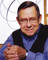
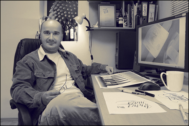
Young walks across the living room of his Sherman Oaks home, sets down a book, and sits across from a visitor. He wears jeans and a dress shirt.

Young is exceedingly gracious. I’m here to interview him, but instead, Young asks me questions and listens intently. He doesn’t talk about himself, his work, or his books.

His modesty is memorable.

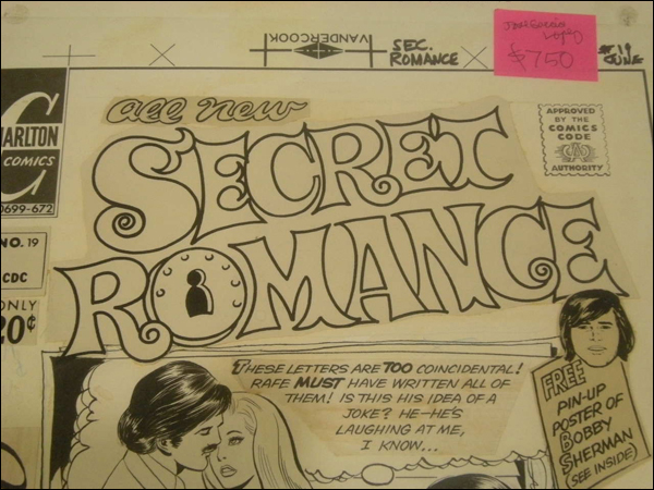
Eventually, we do discuss his new book, Dangerous Curves, a self-published retrospective featuring hundreds of his sketches—logotypes, monograms, titles, and typefaces. dangerous curves 
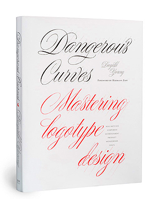
The book is a dazzling exhibition of Young’s skill with a pencil, his discipline, his knowledge of form and nuance, and his affinity for beautiful curves.

If Matthew Carter is the greatest living type designer, and Hermann Zapf the greatest living calligrapher, Young completes the trinity as the greatest living designer of logotypes.

Young’s influence is widespread. Besides his actual work, for a variety of big-name clients, Young has had a profound impact as an educator. In 30+ years at Art Center in Pasadena, California, he has taught more than 4,000 students, instilling in them the attention to detail taught by his teacher, Mortimer Leach. He’s lectured extensively, and his books have become the de facto textbook for many instructors teaching typography and lettering.

The books themselves are special. Young designs the books, oversees the high-quality printing in Hong Kong, and distributes and markets them himself. His last three books have all drawn high praise.

Lettering artist John Langdon called Fonts & Logos “the bible, the map, and the Rosetta Stone for those who would carry this low-profile high art into the twenty-first century.”

At age 82, Young continues to draw letters and logotypes, gives lectures, teaches an occasional class, and often, he says, you can find him in the role of shipping clerk, standing in line at the post office to send out more book orders.

I ask him if another book is in his future, and he smiles. “You never know.”

this portion of the interview conducted via e-mail

q and a

How has Dangerous Curves been received?

I’m delighted to say that the reviews have been enthusiastic and I’ve sold cold copies in Scotland, Ireland, England, Sweden, Germany, Turkey, Dubai, Australia, New Zealand, Okinawa, Japan, China, Brazil, and as far north as Yellowknife, Canada.

[click to continue…]

{ 21 comments }

UA- 4983358