

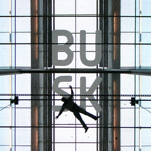
B.U.S.K. — You may have noticed the combination of letters before. The
name/alias of one of Austria’s most prolific alternative artists appears all over. Different cities, different mediums of choice, different approaches. From spray paint, to paste ups, to folded paper, to type design. His love for typography and lettering arose around 1995 and since then, he has continued to amaze with his (art)works and stunning output.

So what do you like about lettering and drawing/creating custom shapes
and characters?
To write your name legibly…just joking! It is a system of styles developing through time, only the sequence of single styles and signs gives you the basis to interpret the whole content. With this approach you are very free in conception and also in creation. Everything is allowed!
Definitely some questions arise, like the requirements or application area of a special font or font-family. But basically you can approach such projects in an instinctive, or better yet, playful manner. You don’t need to write a pages-long concept—it’s like instrumental music: Either you like it or you change the channel.
When did it all start? And what made you do it?
My interest for fonts as form developed out of the classical ‘writing’. This was in the years around 1995/96. I drew my first font in 2002…a jewel! At the moment, I’m working on a corporate design for a small transport and logistics company.
Which tools do you use? Any preferences?
Ballpoint pens, markers, standard A4 sheets, checkered exercise books, my old digital camera, Adobe Illustrator, Fontlab Studio 5, black and white printer and very importantly: a good pair of eyes.
What would be your favourite word to write?
B U S K
Any favourite (existing) typeface, or do you prefer to start from scratch?
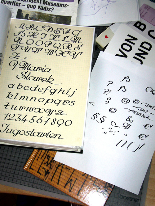
The fonts I’ve been drawing up to now all started from scratch—with the exception of a calligraphy sheet from my deceased grandmother, which I had found. It was a very intensive time as I tried to develop a living font out of that dead sheet. I tried to preserve the character of the signs my grandmother had provided. I just knew her by some photos and suddenly I spent (a) very intensive 3- or 4-month period with her. I think it was a very meditative time we spent together, trying to make her, or at least some aspects of her personality, alive.
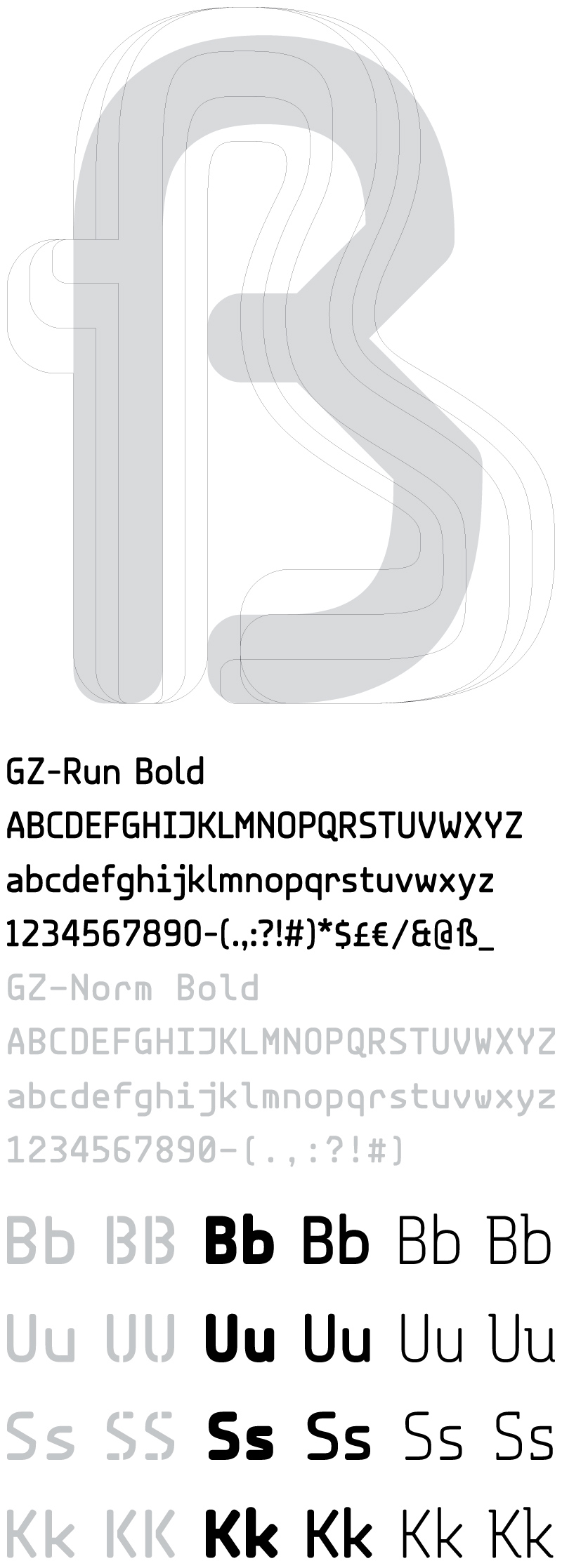
With the other fonts I did everything myself. From the first sketches in my imagination to the data-backup of the completed font. For example the City-70. The first sketches emerged at the end of 2005. Then I had drawn the font just as a lowercase and it was impossible for me to find an elegant solution for the uppercase even though I tried hard. I wasn’t satisfied with any result, I now realize that I had the wrong requirements and opinions, but I didn’t understand it at that time. In 2007-08, I was working with the old files for a new logo and suddenly I realized the problem I had two years ago and I drew everything afresh, in lowercase and in uppercase. The logo never came into existence.
Sources of influence? What inspires you?
Lettering of any kind and everything else.
Name your ‘heroes’?
Donkey Kong, Joseph Kyselak, Marcel Duchamp
Anything people don’t (but maybe should) know about you?
YEAH…I love my vintage rc-buggy ULTIMA II and many more.
interview by Dav(id) Hubner


LINKS


{ 6 trackbacks }
{ 9 comments… read them below or add one }
lens 11.17.08 at 3:15 pm
i LOVE …
0717 11.17.08 at 4:12 pm
thumbs up to one of vienna’s finest!!!
kenneth 11.17.08 at 7:39 pm
This is some good stuff.
beat.researcher 11.17.08 at 10:49 pm
agreed, this is quality. very nice lettering.
/me trots down flickr link lane
lens 11.18.08 at 5:50 am
somethin else: find the one or other shortfilm featuring BUSK on my artist page… the “view video” button is on the upper left side. and there is one more thing you should not miss. the “Busk-Cmod-Gasse” Vienna photo documentary … greets http://www.rotaug.com
Nate Williams 04.10.09 at 6:29 am
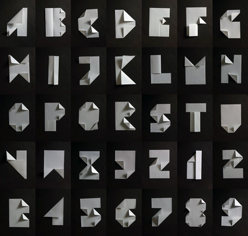
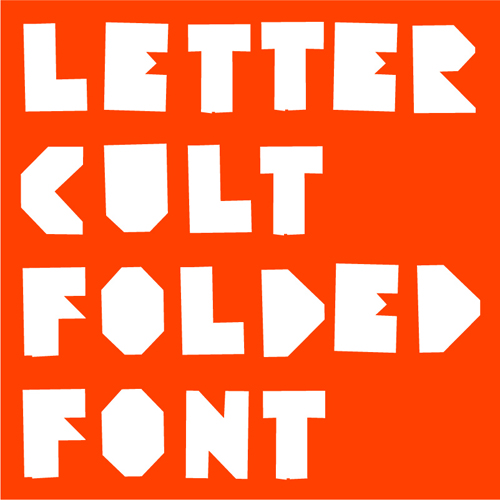
beauuuuuuutiful work! great interview .. especially love the folded letter font.
David Heatley 04.10.09 at 6:45 am
That folded paper font is just genius.
el norberto 04.16.09 at 8:42 am
wooooow, great work, great idea and great site, i love it, don´t stop and follow creating more type….
Congratulations
hello from Mexico
Ziemowit Maj 04.19.10 at 3:08 pm
crazy guy, lovely work.