

PENCIL. RULER. FRENCH CURVE. RAPIDOGRAPH. VELLUM. X-ACTO KNIFE.
If you were an independent type designer, circa 1977, these are the tools you might use to create a typeface.
These were the tools that Mark Simonson used to create Kandal, a wedge serif typeface with an intriguing backstory. 
The Making of Kandal spanned three decades, four Presidents, and a move from ink to digital.
Simonson began the typeface in the 70s, and called it Excalibur; it was tweaked in the 80s; and it was finally released in the 90s as Kandal.
Simonson, whom we interviewed last fall, agreed to an in-depth discussion of the typeface.
In an age of digital creation and instant gratification, it’s instructive to look at how things used to be done, sans computer. And Kandal is also a story of persistence in pursuit of a dream.
We go back to 1977.
Simonson was in college, studying graphic design, when he really started to pay attention to type. For example, he was intrigued by the differences between Univers and Helvetica.
He didn’t think about making type. Until…
One day at school, he noticed an oversized publication scattered about. He reassembled the pages, and that’s when he discovered U&lc, the magazine.

“It was like a bolt of lightning to my interest in type at the time. And was a major factor leading to my interest in designing typefaces,” Simonson says.
His immersion into typography sparked a desire to publish a typeface. The best place to do that was International Typeface Corporation (ITC).
“Their faces were very popular, they were not tied to any particular typesetting company or typesetting method, and the offer of an up-front payment ($1,500 for each weight/style) plus royalties (10 percent) seemed very good at the time,” Simonson recalls. “Letraset or (VGC) might have been good alternatives, but their fonts were tied to a specific manufacturer, for example. There was practically no place else like ITC.”
Now, if you look carefully at the jpg at the very top of the page, in the lower right corner, you’ll see a note, partially obscured.
Please write and tell me what you think of my design and how I can make my dream come true. Typographically yours, Mark L. Simonson
The dream was real, and Simonson was living it, doing everything he could to make it happen.
“I was composing the letter I wanted to send to ITC,” Simonson says of the note. “I was naive and full of myself, and getting all worked up about it…It’s sort of embarrassing, like those notebooks from high school with the name of a girl you had a crush on, all over them.”
Simonson, in his own words, describes how he created Excalibur, which was influenced by the Jenson-esque type that Jim Parkinson was creating for Rolling Stone.
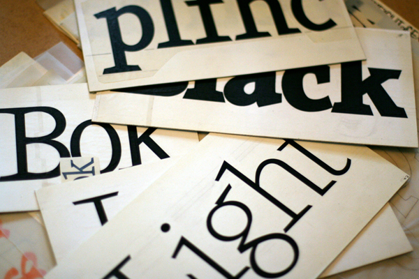
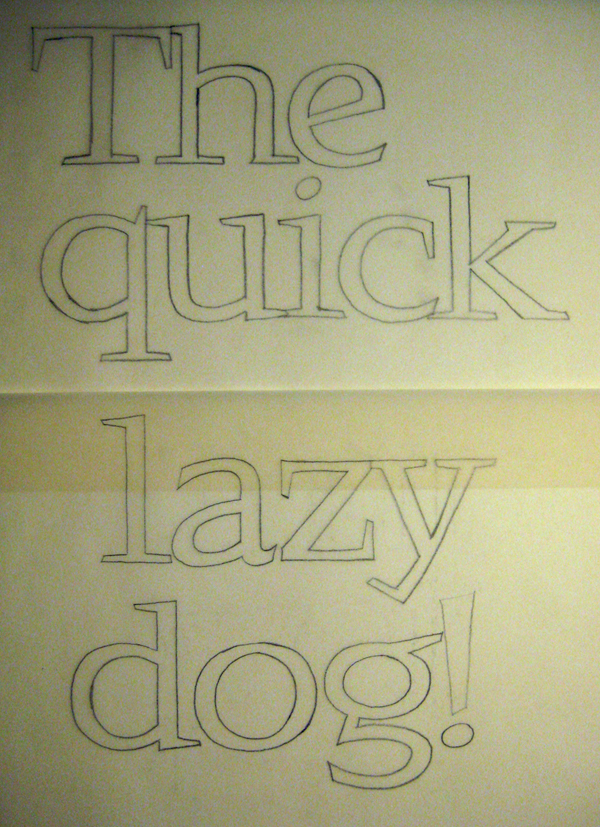
Simonson: The preliminary sketches were not unlike what I do nowadays. The finished sketches—which I intended to be the basis of the final art—were in pencil on tracing paper, about 4 inches on the cap height. I traced these using markers onto tracing paper in order to ‘preview’ how the final letters would look.
I did the uppercase, lowercase, numbers and some punctuation for the ‘regular’ weight. I also did a few letters for each of the other three weights and italics I had planned, enough to spell out the names of the weights (Light, Book, Black, etc.). I also did sample finished art for the regular weight ampersand. This was drawn on illustration board with a Rapidograph technical pen, and filled in with a brush. Corrections were made by scraping ink from the board with an X-ACTO knife.

I used ellipse and circle templates, French curves, and straight-edges as aids in drawing the curves, following my freehand lines. Most of the measurements were done with improvised rulers (marks on the edges of paper scraps) and marked with notes about what they were for.
Interpolation was done similar to Frutiger’s method.
I made scaled-down photostats of the ‘preview’ letter drawings (about 48 point) and pasted them up and made a film negative, which was then used to make dry-transfer sheets using a system that 3M had at the time. Basically, I wrote a cover letter I intended to send to ITC and counted out how many of each letter I would need and used that as a guide when I made the transfer sheets. I then ‘set’ the letter in my typeface using the homemade transfer sheets. This was reduced further to make the final letter as a photostat with type about 14 points.

HE SPENT MOST OF HIS FREE TIME ON EXCALIBUR, MONTH AFTER MONTH, FOR nearly a year. In September 1978, he was ready to submit to ITC. He put together a package of stuff. A year’s worth of work, ready to be judged.
“There was a hand-written cover letter (two pages), a sample of the a ‘final’ drawing, using ink on illustration board…and a second cover letter, the one I made with the homemade transfer type, which served as a sample setting of the typeface,” Simonson says.
“I was really glad to finally be done with it. It took much longer than I expected it would and was agonizingly tedious at some points. I really questioned at the time whether this was something I wanted to do again.”

Then he waited.
He waited some more.
Finally, in January 1979, the mailman dropped off a return package from ITC.
Rejection.
“It was a big letdown because I felt like I had spent so much time and effort on it,” Simonson recalls. “I thought it was really good, but I had no perspective or experience. I had an inkling that it might not be as good as I thought when I started trying to set the cover letter and when I saw it reduced to text size. I realized I had created some serious spacing problems with the way I designed the serifs—they were way too big. I sent it anyway, figuring that, if it was accepted, these problems would be addressed. In the end, the flaws probably didn’t help its chances.”

He got sick of working on Excalibur; he had some better ideas, anyhow.
But Excalibur would remain in the back of his mind, and he still hoped to improve it.
One day in 1981, while browsing in a used book store, he found a book written by Adrian Frutiger. He was told that the book had been specially ordered from Europe, by another customer, who failed to pick it up.
Despite the $67.50 price tag, Simonson bought it. And when the other customer tracked him down and wanted the book back, that’s when Simonson realized he truly had something special.
Frutiger’s book, Type Sign Symbol, revealed many of the tricks of type design, and gave him some new ideas to improve Excalibur.


Then, in the mid-80s, when the Desktop Publishing revolution was taking shape, Simonson discovered Fontographer and he jumped back into type design mode.
Maybe he could revisit Excalibur?
“Working on it in Fontographer caused me to reconsider its potential as a viable typeface,” Simonson says. “In fact, working in Fontographer taught me how much I didn’t know about designing typefaces. It’s one thing to imagine the design and draw some letters, which is what I had been doing for years before using Fontographer, but it’s quite another thing when you start setting those letters into words and paragraphs. I found out that I didn’t know anywhere near what I thought I did.”
Simonson worked on several other faces, including Proxima Sans, and by 1992, he was ready to make a pitch to Mark Solsburg at FontHaus. (Excalibur’s name was changed because an existing typeface had the same name.)
“In July 1992, I faxed FontHaus a list of one-line HAMBURGERFONTS samples of fonts I was working on, about 1-inch tall on the cap height,” he says. “They picked Felt Tip Roman, Kandal (8 fonts), and Proxima Sans (6 fonts) and I signed an exclusive distribution agreement with them in August.”
Excalibur/Kandal finally had a home, 15 years later.
“I was excited,” Simonson says. “But it also meant I had a lot of work to do…I didn’t really think of it as the same face I submitted to ITC, which I regarded as a half-baked failure.”
At the time, Simonson was drawing his letters in Illustrator, and the ‘fonts’ he’d shown FontHaus were really just glyphs on a digital artboard.
“One thing that surprised me was that I was expected to create the finished shipping fonts,” Simonson says. “With ITC, it was taken for granted that experts would turn the designer’s artwork into an actual font, and that the design would most likely be adjusted and optimized by people with years of experience producing fonts for typesetting. The fact that FontHaus offered very little technical or production help kind of freaked me out.”


Kandal was finally released in 1994.
Now, Simonson works entirely digital, primarily in FontLab.
“I would never go back,” Simonson says. “You do get a certain sense of accomplishment mastering things like French curves and technical pens, but the process is just so unforgiving and inflexible and slow. Unless you are trying to give a typeface a handmade look, it’s just not worth it. Plus, with the efficiency of working digitally, you can do so much more than just draw the letters. You can work out the spacing at the same time, play ‘what if’ scenarios with different design ideas, see how a partially designed font looks set in a paragraph, things that would be impractical or impossible working with traditional tools.”
And finally, Simonson adds a postscript…pun intended?
Kandal is not done.
“Fifteen years later, there are a lot of things about the 1994 release I would change,” he says. “I’ve already revisited Proxima Sans and it’s likely I’ll do something similar with Kandal at some point. So, I don’t think it’s the last version yet.”
LINKS
MS-Studio
Mark Simonson dot com
Mark’s Pangram Helper
Mark’s National Lampoon Site
SEE ALSO
Kandal page
FontHaus
Frutiger’s Type Sign Symbol @ Bookfinder.com
Jim Parkinson
MORE PICTURES


next up: interview with Jordan Jelev, June 15

{ 6 trackbacks }
{ 8 comments… read them below or add one }
Jannis Gundermann 06.08.09 at 7:28 pm
Excellent typeface and a very nice article to go along with it.
Kudos & Thank you.
J.
Luke Dorny 06.08.09 at 11:12 pm
This was awesome. Thanks for sharing, Mr. Simonson.
This is quite inspiring and a wonderful read.
Seth Nickerson 06.09.09 at 7:34 am
Great story. I love getting a glimpse at the sketches and stories (and people) behind typefaces.
Ale Paul 06.10.09 at 6:24 am
Thanks Mark for sharing that history to everyone. Lovely.
Addison Hall 06.11.09 at 2:46 pm
I’ve waited and waited to see Kandal revised in OpenType. Proxima Nova is one of my favorites — I can only imagine what Kandal will be like…
Marc Oxborrow 06.16.09 at 1:53 pm
Kudos to both LetterCult and Mark for a terrific peek into the type design process.
I started my design career right at the end of paste-up and the beginning of DTP, and I gasped when I read about Mark composing an entire letter with rubdown type!
Anne 07.01.09 at 8:25 pm
Interesting! What I want to know is: did Mark sell the book (back) to the person who had it ordered in the first place, or did he keep it?
Mississippi Web Design 04.21.10 at 10:43 am
Thanks for sharing this! Great story! It’s rare to see the faces behind the typefaces…