

THIS PAST SUMMER, AUSTRALIAN UNIVERSITY student Gemma O’Brien came down with a severe case of Typomania.
Talking about it, reading about it, only made it worse.
She couldn’t shake it. So she embraced it.
“My interest in letters and typography became obsessive,” she says. “I began doing more readings on the history of printing and typography. And then everywhere I looked was letters. EVERYWHERE! And they are so exciting! Soon i was writing on FedEx boxes, fruit, myself, and who know’s what next?”
O’Brien adopted the moniker, Mrs. Eaves, and started a blog, For the Love of Type, where she began to show her type and lettering experiments.
She put one such experiment—Write Here, Right Now—on YouTube. The video shows O’Brien writing Write Here Right Now on her body with black marker, homage to designer Stefan Sagmeister.
The damage: 8 hours of writing, 5 markers, 3 baths and 2 showers to get clean. The video logged more than 185,000 views, and even wrinkled the trousers of a stuffy German type blogger, who wrote about “amateur designerin hat sex mit buchstaben.” O’Brien discusses that provocative post, and more, in this interview, conducted via Skype.
For a lot of people, the first exposure to your work was the Write Here, Write Now project. Can you explain how that started, and how that evolved?
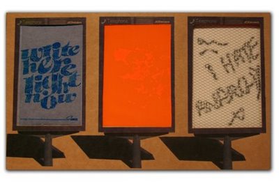
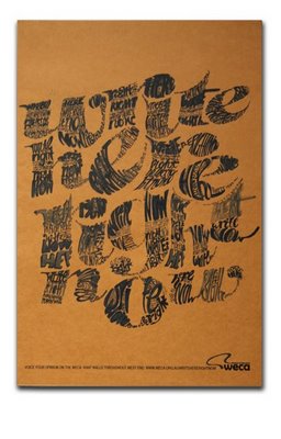
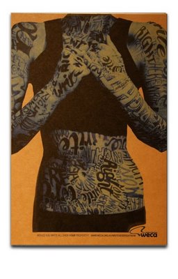 Okay, well basically as part of a university project, I was given the brief to identify an issue with a community, and create an awareness campaign to respond to this. Initially, it was supposed to be purely a print campaign…but I wanted to a take it a bit further and incorporate an ambient element and a viral campaign. So the issue was graffiti and vandalism, which was a problem in the community. But it wasn’t only vandals who were writing on the walls, it was also well-educated, opinionated individuals who wanted to get their views out there. So the whole campaign was about creating designated writing walls/graffiti spaces where the community voice could be heard. In order to make people aware of this, a type-covered girl (who in the video was myself) would walk down the street, followed by bus stop posters, which would appear in the following few weeks.
So I got out a black pen and started with my hands as a test…then the following week did my whole body, well, nearly my whole body. The YouTube response was amazing.
Did this project eventually make it to bus stops in Australia, and how was the response locally?
Write Here, Right Now—the tagline—would reference the places which would later be the writing zones. At this point, it hasn’t extended beyond the YouTube- and blog-world, but I guess there is potential to propose it to local Australian councils where graffiti may be an issue. Overall the response to the concept and idea has been very positive though.
So this project got you mentioned on a German typography blog. Can you tell us about that?
Well after about a month or so that the original YouTube video was posted, I came across a post on FontBlog—the blog element of FontShop. I had seen various bits and pieces about the YouTube video and my blog, on pages around the world—but this one seemed to specially reference, in perhaps a negative/critical way, my post in general. It was titled Amateur Designer has Sex with Letters and so immediately I was curious to its content.
Did you wonder what was being said?‘
Unfortunately, as I don’t speak any German, I did translate it and got the general gist. Adam Twardoch from FontLab sent me a more accurate translation
Did it upset you, puzzle you?
I wasn’t upset, more surprised at the level of interest solely in my blog. Most of the feedback up to that point had generally been positive and it was interesting to see a critical point of view. The main comments were that my work was unoriginal, followed Stefan Sagmeister too closley, and suggested that if I was a designer, I should be posting my work on a website as opposed to the Blogger platform. Ultimately though, I feel that my blog is a platform for my inspiration, typographic experiments, and explorations, and I do try to reference my inspirations, especially if they are designers, as much as possible.
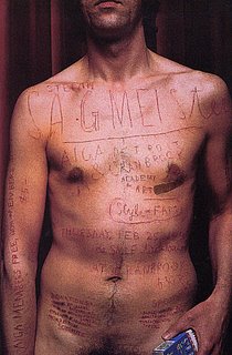

Sagmeister carved letters into his skin, and also did the Lou Reed piece. How much did you think about those, and how much were you just going with your gut feeling?
Of course I was inspired by Sagmeister’s work—it was amazing (and I’m sure very painful) and relevant to the message he was trying to get across. At the same time, what I did I felt was relevant to the messsage I was trying to get across. And if cleaning graffiti off a building is anything like scrubbing permanent marker off your skin, hopefully it was effective.
Now that you’ve had some time to think about the criticism, what are your thoughts on the FontBlog post?
I think everyone is entitled to their own opinion…but at the same time, different kinds of typography and mediums are relevant to different projects. Perhaps (the) comments were a little grumpy and uncalled for. Apparently, (they) also (have) some issues with anonymous bloggers.
When did you start using the Mrs. Eaves moniker?
Mrs. Eaves came about with my blog. I knew about the story of Mrs. Eaves. She was the maid (and mistress) of John Baskerville and aparently was involved in some of his type designs. As (Zuzana) Licko mentions about the typeface design, named after Mrs. Eaves, it references a forgotten female in the largely male-dominated type arena.

So as a student, are you studying typography and do you foresee a future in letters?
I am studying a Bachelor of Design where graphic design and typography only make up a portion of the course. It is definitely an area where I would love to do more work. I love doing custom lettering, especially created by hand. At this point I have very little experience in typeface design, which is something I would be interested in pursuing further.
From a type and lettering perspective, who are you inspired by? You’ve mentioned Licko and Sagmeister.
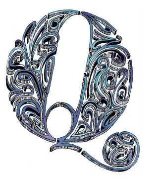
Yes, apart from those two, I really admire the typography pioneers of the 20s and 30s who were experimenting with type as image, and type being expressive—the Futurist and Constructivist artists. I love the work of the early “commercial” printers—H.N Werkman, Piet Zwart. As well as Jan Tschichold and Paul Renner. More recently, and particularly from an illustrative type point of view, I love the lettering work of Si Scott.
Lastly Gemma, what are five things that people don’t know about you?
1. I have bizarre sleeping patterns.
2. I once used Comic Sans (I think I was under the age of 12 so maybe that’s acceptable?)
3. I once made a letter “C” out of toffee.
4. I am in a band called The Yeah-Nos.
5. For my 21st birthday, I had a Come-As-Your-Favourite-Typeface party and went as Bell Gothic.
LINKS
SEE ALSO


{ 6 trackbacks }
{ 5 comments… read them below or add one }
johno 09.29.08 at 8:30 am
Nice interview with a very talented young woman. I love her work, and the only thing that disappoints me is that she is not more widely know. Let’s spread the word. And to those who suggest where she posts her work, may I suggest that those detractors post their comments where… (well, you can guess where).
Robin 09.30.08 at 10:31 pm
Great interview. I’d seen that video floating around before. The come-as-your-fave-typeface party idea is GOLDEN!
Jeff 10.02.08 at 12:44 pm
Sure the writing on the body is very Sagmeister, but so is a ton of design out there. I think the strech into other mediums with the “Write here…” campaign does a good job at setting it apart. I do like Gemma’s work and she seems to have good tastes in artist inspirations (Si Scott being a great mention).
Mike 07.13.09 at 5:22 pm
Reminds me of Peter Greenaway’s 1996 film The Pillow Book, about a girl who becomes obsessed with writing in ink on skin. It’s one messed up film, but required (and fascinating) viewing if this sort of tyopgraphy / art is your thing.
See IMDB’s entry on the film at http://www.imdb.com/title/tt0114134/ for more info
Suzy 01.08.11 at 8:26 am
Hi,
I was wondering what meaning is of the image with the word ‘Milk’ written with coffee? Why did Gemma use such elegant letters with such raw material? I like the contradiction between the letters and the material.
Grtz !