

ASERIES OF FORTUNATE EVENTS nudged Mark Simonson in the right direction, the type direction, and from there, his considerable abilities took over.
Back in 2000, Simonson launched his own shop, specializing in lettering and typography. But when it came to type design, he was a hobbyist. A dabbler.
That all changed thanks to some remarkable occurrences—a few good connections, a well-timed type convention, an indie font book, the emergence of e-commerce, and a dash of Regis Philbin.
Simonson rode the momentum and now designs type full time, inspired by a love of letters, their history, and a fascination with angles and curves. He has more than 100 fonts on the market, and in a way, he’s just getting started.
“Making fonts for a living is a life-long dream,” Simonson says.
Simonson, now living the dream, picks up the story of how events unfolded, taking us back to 2000.
Simonson: A friend of mine who works at a newspaper told me about a guy who sold fonts at the SND (Society for News Designers) convention…he knew that I had dabbled a bit at making fonts, and had a few for sale through FontHaus. He asked if I had any new ones I might want to distribute through this guy. 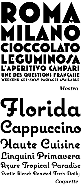
It didn’t work out, but I ended up with some new fonts ready to sell. I found a website called Makambo and started selling them there. (Makambo) went belly-up and I was invited to MyFonts. Things just started snowballing from then on. 
A big break came when I got involved with TypeCon 2003 in Minneapolis. I got to meet other people in the business for the first time. Indie Fonts 2 was in the planning stages and the people doing it (P22) were on the TypeCon committee. So I got involved with that (IF2). I didn’t have many fonts out yet and had 18 pages to fill. So I challenged myself to make 35 new fonts before the book was out. I didn’t quite make it, but it really got things going for me. Also, a lucky thing happened in late 2000. My partner was a contestant on Who Wants to be a Millionaire where she won a sizable sum of money. This allowed me to take six months off from my freelance design work in 2001 to just work on fonts. During that break, I created two of my best sellers, Mostra and Coquette. (Also Anonymous, but that’s a freebie.)
Wow, the type community owes something to Regis. And what about Adrian Frutiger? You gave a talk on Frutiger’s influence on you—though you’ve never met him.
I think the talk I gave about him may overstate his influence on me a bit. I was on the committee for choosing the winner of the SOTA award for 2006 and we picked Frutiger. They asked me to do a talk about him at TypeCon, about his affect on me as a type designer. If you look at my fonts, you probably wouldn’t see a lot of his influence in terms of style, but his book 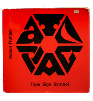 was an eye-opener for me, especially the way he got into the analytical side of making letters. He was like a magician revealing how the tricks are done.
I see. So let’s talk about your lettering, something that you’ve been doing all along. Are you going to continue with that, or is type design going to be your main focus?
I do some lettering, and I like doing it, but the market for it is very small. Even some famous lettering artists I know, who used to be doing Time magazine covers and album covers and stuff, are having a hard time getting lettering jobs.
It doesn’t seem like it’s being taught enough in design school. As House puts it in its description for Studio Lettering, “this bygone skill has sadly fallen to the wayside.”
Yeah. Before computers, Lettering was one of the courses you had to take to get a commercial art degree. Getting type set cost a lot of money. You had to get a design approved before any type could be set, so ordinary designers needed to have some basic lettering skills.  But even back when I started, in the mid-70s, not a lot of people were doing finished lettering for reproduction. It was already becoming more like illustration, the way it is now….I think the reason you don’t see as much lettering anymore is that you can do so much more with type than you could in the past.
There are a lot of people confused about type and lettering—and when type should be invisible, or expressive.
Type, back in the metal days, was very inflexible—not many sizes, not many styles. That’s where the demand for lettering came from. When type got more flexible, it made a lot of that obsolete….I do think that type should usually be invisible, but there are also times when you want it to take center stage. When I say I think of lettering as illustration, that’s what I mean.
So as OpenType capabilities grow, do you foresee less and less lettering?
OpenType makes type even more flexible, so, yes, that erodes the need for lettering further. But there are still things that can only be done with lettering, mostly having to do with irregularity. And you can do something 100 percent unique. Type can almost never venture there. It’s predictable and repeatable by its nature.
![]()
On his site, Doyald Young states: “The only way to create a logotype that is truly unique is for the designer to transcend the limitations of the available fonts and typefaces on the market.”
That’s a good way to put it….I see this a lot when I look at old lettering. People think there are so many fonts, how can we possibly make more. But then I look at old lettering and every instance is unique (or nearly so), and very few would match an existing font. The variety in lettering is huge compared to fonts.
Speaking of old lettering, you’ve helped Stuart from Font Diner revive some of the Filmotype faces. Can you talk about that experience so far?
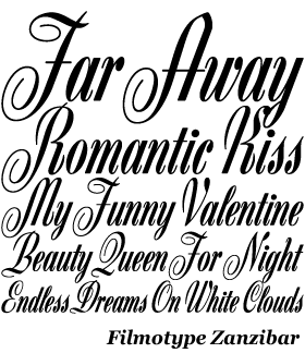
Stuart Sandler got interested in Filmotype a while back and started doing research on the company. (He’s working on a book about it.) Along the way, he acquired the rights to the name Filmotype and has been actively trying to revive the library. Most of it was created in the 50s. It was one of the first headline-setting photo type machines. Basically, they were selling a system that would allow any designer to create their own “letteringâ€. A lot of the designs were based on common lettering styles being done by lettering artists at the time. In fact, the guys who designed most of the fonts were lettering artists working in the Chicago area. The system was inexpensive, easy to use and small, so a lot of studios bought them. They didn’t have to send out for type—they could set it right in their studio or office. It also didn’t require a darkroom. Typesetting houses didn’t like it—because it was so easy to use. Stuart and I visited one of the founders of Filmotype and he said that the Typositor (a competing machine designed by a former Filmotype engineer) was made complicated on purpose to appeal to the type houses.
Do you have more Filmotype faces in the works?
I’m mainly working on the “G†series right now, which is a range of condensed sans serifs. I admired them for a long time, even before I knew what Filmotype was. When Stuart invited me to participate, and I realized they were part of the Filmotype originals, I got really excited. So that was a big reason I signed on. They are unique among condensed sans serifs.
Most similar faces follow the grotesque model, but the Filmotype G series seem to be influenced more by Futura. They also have some subtle hand-lettering qualities. I’m also going to be doing some fancy (formal) scripts. Really wild stuff. One more thing about the Filmotype fonts: A few of them have been digitized by others, but they almost never include the alternates and things like that. And the quality is often not so good. Filmotype got pirated a lot back in the photo type days, so you see a lot of their faces with different names, even by supposedly reputable film font companies. Stuart’s dream is to “remaster” them to very high standards and include everything that was in the originals, plus all the stuff you expect in modern digital fonts.
Nice. Looking forward to seeing more from that collection. On a different subject, you’d mentioned earlier that most people think that fonts are easy to make—to them, it’s like pushing a few buttons on a machine.
Yeah, it’s not always easy to explain when you tell someone you make fonts. Sometimes people get it right away, especially designers. But sometimes it’s as if you told them you design bricks. People equate fonts with the alphabet. It’s just this thing that has existed forever. But once you start explaining how it works, most people find it (or seem to find it) interesting. If it’s a friend or relative, you sometimes start getting reports from them when they see your fonts in use. Previously, they wouldn’t have looked twice at type.
Is Felt Tip Roman your most ‘visible’ font so far?
It’s the easiest one to find examples of in print. It’s been out for about 15 years. I would think that everyone who wants it has it by now, but it’s still my biggest seller. I think its visibility helps sell it. People are not as eager to buy a font they’ve never seen used before.
That one is based on your own handwriting?
Yes. I did it on a whim when I first started making fonts in the late 80s. I scribbled out the standard character set, scanned it into my Mac, and carefully traced it (manually, not autotrace) in Fontographer. I was very careful with the spacing which I think is really important. 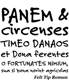 A lot of handwriting fonts have really bad spacing which makes them look bad, even if the letters are okay. I didn’t do anything with it at first. But then I used it on a couple of design projects. People seemed to like it. I didn’t quite get it. I thought, if you wanted something that looked like handwriting in a design, you should just do it by hand. I even thought about putting it in the public domain font collection on CompuServe. When I started shopping my fonts around, I threw it in for the heck of it. FontHaus really liked it. I had no idea it had any commercial potential.
So looking ahead, you have quite a few of your own ideas to get out. How do you see the next few years going, typewise, and what’s on the front burner?
I have a really big family in the works, but I don’t want to say more about it right now. I’m also doing new OpenType versions of my older fonts. Rather than just convert them to OpenType, I want to add new design features to them. For example, Refrigerator Deluxe will have lots of alternate characters and a new weight. I also want to do some decorative styles—things like bevels and shadows—and a slanted version, but they may have to wait. I’m also working on new OpenType versions of Mostra (adding a lower case) and Coquette (things like plain caps and alternates, maybe other styles or weights).
On Adrian Frutiger’s Type, Sign, Symbol book: [Frutiger] was like a magician revealing how all the tricks are done.
The big family, how soon will we see it?
I have no idea, that’s why I don’t want to say much about it yet. It’s still in the early stages. I wish I could have it instantly done because I think it will have a lot of appeal. I guess I can say it’s a revival of sorts with both serif and sans serif styles. There have been a lot of ambitious font projects lately, like Ken Barber’s Studio Lettering collection and Nick Shinn’s Scotch Modern set. I guess I got the bug, too.
Exciting time to be a type designer…
Yes, I think so. I worry somewhat about the long-term viability of the profession, with things like the ability to use fonts on a web page just like you can do with images. I understand people wanting to have that, but I don’t know what the business model is from the point of view of font makers. I think if people want more fonts, there needs to be a way for font makers to survive. It’s not the sort of activity you can do very well and also have a “day jobâ€. It takes a lot of time and energy. I had been wanting to do fonts for a long time during the 90s, but I had a full-time job and was raising a kid. Not much font making got done.
So as a final question, what are five things that people don’t know about you?
Gee, if they read my website, they might already know a lot. Okay…
1. I dabble in model railroading, and have a subscription to Model Railroader.
2. I run a website on the side devoted to the “golden years” of National Lampoon magazine (early 70s) and, as a result, have gotten to know a lot of people who worked there, including one of my heroes, designer Michael Gross.
3. I have a weird ability to find things. For example, my daughter misplaced the key to our neighbor’s house, where she was taking care of their pets while they were out of town. She panicked and spent 15 minutes looking everywhere she could think of. She asked me to look. I stood up, looked around for a minute, and then walked directly to a handbag she uses sometimes, and pulled out the key. I have no idea how I do it.
4. I wanted to be a filmmaker at one time and still daydream about it.
5. I am a big Mystery Science Theater 3000 fan and tried to get work from them in the early 90s (which I didn’t) but did get a neat tour of Best Brains studio out of it.
LINKS
MS-Studio
Mark Simonson dot com
Mark’s Pangram Helper
Mark’s National Lampoon Site
SEE ALSO
Michael Gross
Model Railroader
Nick Shinn
House Industries Studio Lettering
TypeCon
SOTA
FontHaus
P22
FontDiner
Filmotype
Mystery Science Theater 3000


{ 2 trackbacks }
{ 4 comments… read them below or add one }
Piotr 09.29.08 at 5:30 am
Another very interesting article. You got yourself another reader Keep up the good work.
Kind regards
Nicole Brunet 09.29.08 at 10:49 am
I just stumbled across your site yesterday, and I’m hooked. My mind in suddenly spinning over things I’ve seldom stopped to think about before in something so everyday as lettering and type. Bravo.
VRizo 09.29.08 at 4:40 pm
Great read, as are the other posts. You’ve got a regular out of me… I love reading about the people behind the brilliant fonts more than finding brilliant fonts! I would have never known of these wonderfully talented people without this blog. Please, keep the great interviews coming!
Dan 09.30.08 at 4:12 am
Wonderful site. You have a new subscriber.