

MISS GARVEY, THIRD GRADE TEACHER, was the first to notice his gifts. John Solimine would shift uncomfortably in math or science, but when it came to art or penmanship, he was Miss Garvey’s prize pupil.
He could draw better than most kids, but he also really cared about his penmanship. He was a cursive freak. Every curve had to be perfect.
“I wanted my handwriting to look exactly like the letters in the book,” Solimine says.
Fast forward 20 years. Solimine now sits uncomfortably in his cubicle at a large Chicago agency. He’s doing mostly web work. Long hours in a stressful environment—kinda like third grade all over again. In the thought bubble over his head, he’s picturing a different life. One in which he could draw every day, work with his hands. He’d be happy with that.
So finally, one day in November of 2006, he quit his job at Leo Burnett.
“I found myself putting a lot of effort and hours into something that I didn’t like and wasn’t learning anything from,” Solimine explains. “Despite the healthy paycheck, I was fed up enough to throw all that effort into something that I actually enjoyed.”
Solimine soon started a freelance business, Spike Press, and began making band posters. Now, more than two years later, Solimine is a sought-after illustrator and poster artist based in Chicago. His screenprinted posters are a hit with collectors, and he keeps them fresh with a dash of Custom Letters.
So how did you transition from agency work to poster making?
It was right around the time that screenprinting was coming back.  There were some people in Chicago doing great work (The Bird Machine, Screwball, Kristen Thiele) and I was inspired by those guys to take a class and get my own thing going. It’s a great way to get your work out there independent of magazines/websites/galleries.
Did you get clients right away? Was there a period of struggle?
There is always some band out there that needs a poster, so getting clients wasn’t a problem—I knew some folks from Dayton, OH (my hometown) in a band called Shesus and also worked with some guys who were in Chicago bands. I guess the struggle part is coming up with your own style, working the clichés out of your system—stop ripping other designers off—so your work stands out in the crowded record-store window.
Looking back at your progression, did you use a lot of fonts in your posters in the beginning? Or have you always been drawing the letters?
I did use a lot more fonts at the beginning…I usually would start with a font, convert it to outlines in Illustrator, and then modify it somehow…but the more I started using my own illustration—as opposed to clip or found art —I started hand-lettering more stuff so I could get it to do exactly what I wanted.
And now it seems like Custom Letters have become more standard for you. Why is that important?

Well I think it allows the designer a lot more control over the design—you don’t spend time scrolling through hundreds of fonts looking for that perfect font—you can just make it yourself—and in the process, it helps to unify the design as a whole. I remember working on projects at the design and ad agencies prior to going freelance, and spending hours trying out dozens of fonts in a layout until I found one that seemed to fit, and thinking to myself that it just seemed like throwing darts at a font dartboard—it didn’t feel integrated or considered. It also helps with making your designs unique because your font choice is literally one-of-a-kind.
As a kid growing up, you said you remembered drawing letters. Can you tell us more about that, and about some of your comic book logos?
I remember—and I still do this in my sketchbooks…picking a shape—square, circle, triangle—and trying to draw an entire alphabet using that shape as a basis for each letter. It was like a game.
You were a bit obsessive in third grade. Are you still obsessive about the letters?
Not in my everyday life—like writing a check or something…but yeah that has definitely stayed with me when it comes to the Custom Lettering.
You’ve mentioned a comic book influence. Can you tell us more about that?

I read a lot of comics when I was a kid—and like I mentioned before, all the great lettering in those really inspired me. Just the fact that all the dialogue was done by hand I thought was pretty cool, like there was some guy who’s job that was to draw these letters in little speech balloons all day. And the classic superhero logos were a big infuence: Superman, Batman, Spider-Man, Hulk. They were great. The type was eye-catching and colorful and they also told you a little about the character too—like how THE HULK was written in the letters that looked like giant blocks of cracked green concrete. I didn’t appreciate it at the time, but later I was amazed by Will Eisner’s use of type on the splash pages of the original The Spirit.
Do you have any modern influences with typefaces or lettering?
Sure. As far as hand-lettering goes, I really like The Little Friends of Printmaking. Not all of their stuff is hand-done, but even the fonts they use have that feel and don’t feel slapped on. And I really dig most of the stuff in that book Hand Job—especially Adrian Johnson and Neither Fish Nor Fowl…and Aesthetic Apparatus stands out for just straight-up typography skills…all looks exactly where it should. Also Methane Studios and Art Chantry.
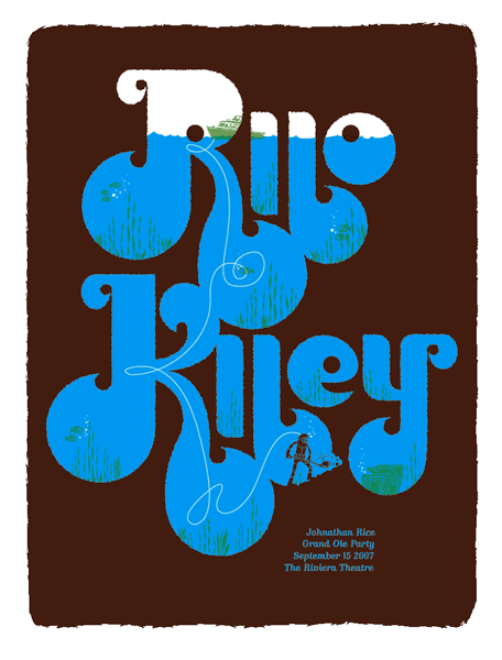
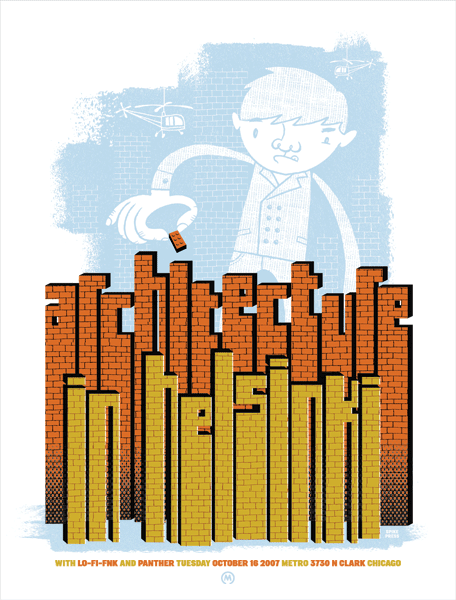
Your Rilo Kiley piece, the illustration takes a bit of a back seat to the letters. How’d that poster come to life?
After I started trying to integrate hand-drawn type into my posters more and more, my posters usually had an illustration that took up most of the page, with some smaller type worked in somewhere. I guess the Rilo Kiley poster is sort of the logical conclusion of pushing that—so the illustration is secondary to the type, but hopefully still feels good as a whole. When I sketched that, I tried keeping the type small, but I liked it so much, it eventually ended up taking over the poster
It turned out great.
Thanks.
So what’s next for your and Spike Press?
I want to branch out as much as possible—I love doing the posters, but I also would like to try out some different things—editorial work for magazines—which I’m starting to get more of. And I also have been kicking around an idea for a kids book that is roughly based on the poster I did for the Rock for Kids charity.
What are five things that people don’t know about you?
1. I have a collection of almost 200 paperback romance novels from the 60s with Nurse in the title: Ski Resort Nurse, Jet Set Nurse, etc., all found exclusively at thrift stores. Take that, E-bay!
2. I secretly still want to draw cheesy men-in-tights superhero comic books.
3. In grade school, I won a Scholastic Gold Key Art Award for writing a poem from Lord of the Rings in calligraphy on fake parchment paper, with a colored pencil drawing of Gandalf in the background.
4. Met the lead singer of Ratt, Stephen Pearcy, at the Peabody Hotel in Memphis while visiting Graceland.
5. Never learned to roller skate.
LINKS
SEE ALSO
MORE!


{ 4 trackbacks }
{ 3 comments… read them below or add one }
Kenneth Glenn 02.23.09 at 6:34 pm
Great Work! This is even better because im from Dayton, OH.
Keep these interviews coming….please.
Michael Hochleitner 02.24.09 at 4:24 am
I certainly appreciate this website!
Ziemowit Maj 04.19.10 at 2:41 pm
Great interview, beautiful type work. An evening treat 😉